Statistics
One of the goals we had when we moved from Cricket to Graphite for statistics was to integrate the graphs more with NAV, instead of having to navigate to another webpage to get the information you wanted.
Graphs are important
For most NAV users, graphs are a very important source of information, and it is important that they are available where needed and configurable to convey the correct information.
The main source of graphs for an ip device is now the IP Device Info tool. For an IP device there are two types of graphs available - System metrics and Port metrics.
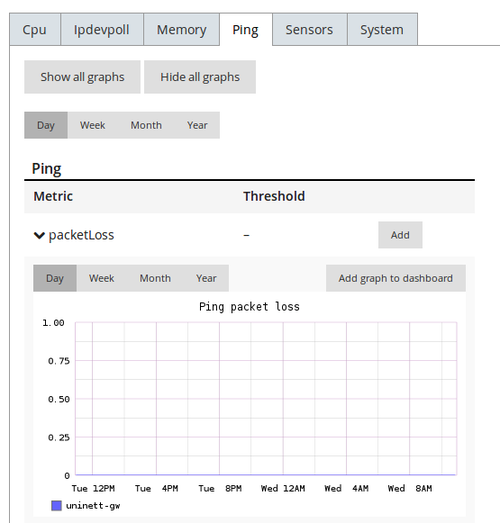
System metrics
System metrics display graphs regarding cpu, memory and other system related metrics.
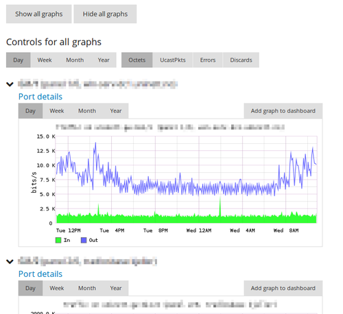
Port metrics
Port metrics display graphs regarding the interfaces of the IP device.
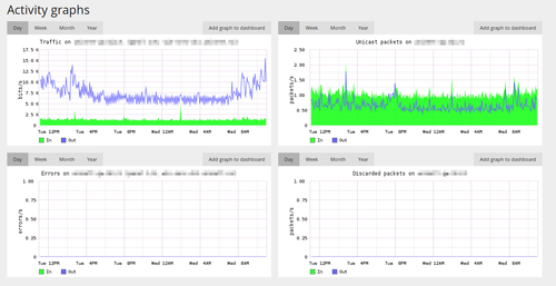
Detailed interface view
The detailed interface view display all related graphs for that interface in addition to detailed information regarding the interface.
Graph controls
Each graph has individual controls for choosing timeframe. In addition there are global controls available for selecting timeframes for all graphs on a page.
Graphs on the dashboard
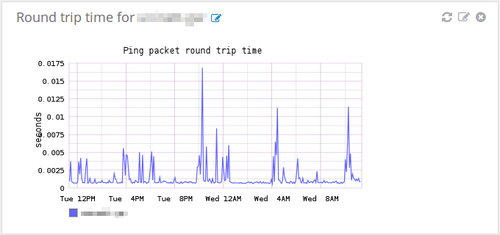
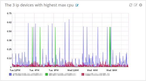
If the graph you are looking at is of special importance you can easily put it on your dashboard by clicking the “Add to dashboard” button. When the graph is on the dashboard you can set a custom title and refresh interval for it.
Custom graphs
If you want to dive deeper and get even more out of the integration, you have the ability to create your own graphs using the Graphite interface. These graphs may then be placed on your dashboard and will refresh themselves automatically.
Test it yourself!
If you want to see and try all this out for yourself, we recommend installing the NAV appliance.